The most difficult thing a web developer has to do is center a div both horizontally and vertically with CSS. There are a hundred ways to get the job done, but let's focus on the most effective and the most used ways.
Without further ado, let's get into it.
Absolute Positioning Trick
This is the classic approach of centering anything in CSS. It was used before modern features such as flex and grid were introduced. Even though now it works, it is no longer used as much.
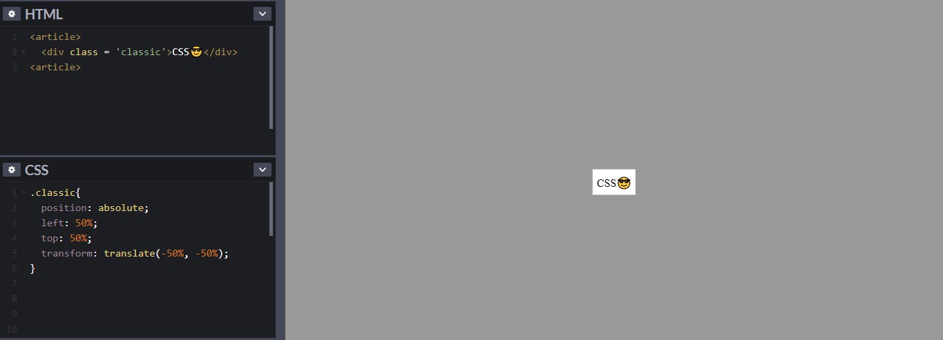
All you have to do is give the div you want to center, a property of position: absolute; and move it down to the right by 50%. This can be achieved by using the property of left: 50%; and top: 50%;.
Doing this, however, won't exactly center the div. In order to accurately center it, you must pull back the div with half of its width and height. This can be achieved by transform: translate(-50%, -50%);
HTML Code
<article>
  <div class = 'classic'>CSS😎</div>
<article>
CSS Code
.classic{
  position: absolute;
  left: 50%;
  top: 50%;
  transform: translate(-50%, -50%);
}

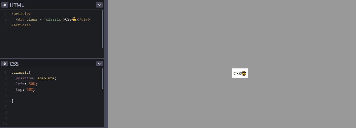
Now, the div is centered. But questions may arise, why use the transform property while even without it the div is centered?
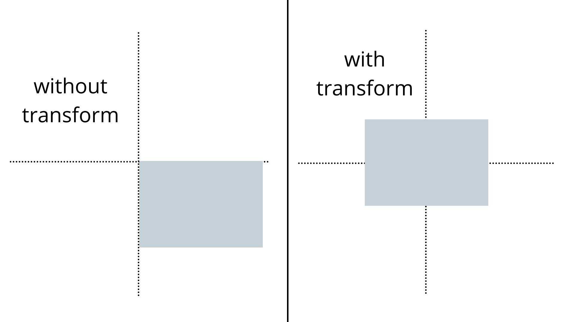
 In the above image, the div is at the center even though the transform property is not used. But it is not accurately positioned at the center.
This is the difference when the transform property is not used and when it is used

This confusing hack was the gold standard until flex-box came around.
Using Flexbox
All you have to do is give the parent the property of display: flex; and align-items to the center using align-items: center; and justify the content to the center using justify-content: center;
<article class = 'flex'>
  <div>CSS😎</div>
<article>
CSS Code
.flex{
  height:100vh;
  display: flex;
  justify-content: center;
  align-items: center;
}
 Keep in mind, however, you have to specify the height for the parent for vertical alignment to work
This is a great option compared to using position: absolute;, but today we can do it with even fewer lines of code using the grid layout.
Using Grid Layout
All you have to do is give the parent the property of display: grid; and tell it to place the items to the center with place-items: center;.
<article class = 'grid'>
  <div>CSS😎</div>
<article>
CSS Code
.flex{
  height:100vh;
  display: grid;
  place-items: center;
}
You also have to specify the height of the parent.
I did say it was simple!
Follow me here on hashnode and on Twitter
I hope this article is useful to you. Thanks for reading & Keep Coding!!
